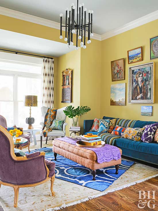
Yellow is one of the brightest colors to decorate with. It’s the most vivid color in the spectrum and the most noticeable to the human eye. Depending on which shade of yellow you use, you’ll convey feelings of either happiness or frustration in your designs.
I’m all for bringing welcoming, warm tones into my home, but I’d like to keep the annoying ones out. Frustration belongs on the I-20, not in my bedroom when I’m trying to fall asleep! So, I tend to stay away from the “negative” yellows (I’ll explain that later) and focus on the positive ones. As Van Gogh said: “How wonderful yellow is. It stands for the sun.”
Here’s how you bring the sun into your home using this beautiful, welcoming color.
 Maria Killam
Characteristics of Yellow
Think of all of the associations we have with yellow. Yellow roses, yellow ribbons, and so on. They all convey feelings of happiness, optimism, creativity, energy, warmth, and enlightenment. Yellow’s color psychology is mostly along these lines, especially when you use a bright, sunny shade. Light yellow, in particular, conveys intellect, freshness, and joy.
Beware, though, because too much can be aggressive, like red. Because yellow can be an intense color, it’ll evoke strong feelings and grab attention (think caution signs and school buses… these things use lots of yellow and are very noticeable)! Overdoing the yellow will get overpowering and overwhelming – and those are words no one wants to associate with the feeling in their home!
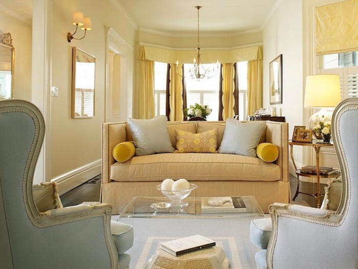
Additionally, you’ll most likely want to stay away from dark yellow in your designs. It can look dingy or sickly. I always think of sitcoms that need to convey that the characters are in a rented apartment. The walls are usually a drab yellowish color. That is not something I’d ever tell you to incorporate into your home, especially if you’re going for feelings of warmth and hospitality!
 Architectural Digest
Where and How to Use Yellow in Your Home
Think about the rooms that you’d want to feel welcoming, joyful, sunny, and optimistic. For example, an entryway welcoming you into the home does well with a bold pop of yellow.
Bedrooms
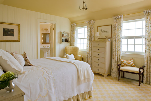
While I enjoy neutral colors and relaxing blues and greens in bedrooms, I also love a yellow for a bedroom, especially a lighter yellow that can invoke feelings of freshness and joy. Who wouldn’t want to wake up to those feelings!
If you’re interested in creating a mood that’s refreshing yet still calm, decorate with light shades of yellow. This is a particularly great option if your bedroom is darker and you want to brighten it up to fight off gloominess.
Think about introducing a lighter yellow in places that take up a lot of space, like your wall color, curtains, rugs, and bedding. Even a bright pop of yellow from a pillow sham or wall art in an otherwise neutral room will bring in some sunniness without overwhelming the space with energy.
You may also enjoy: The Best Master Bedroom Paint Colors
 Houzz
Houzz
Kitchens
I adore the striking yellow backsplash in this kitchen. It’s impactful and pops against bright whites and neutrals, but doesn’t take over like some other colors may in this small space. Because they focused on just a touch of yellow, it’s impactful here instead of being overwhelming.
Decorating with yellows in kitchens is a classic look. Lemon- and banana-hues are right at home in your kitchen. Mix your yellows with modern shapes and accessories to keep your home from feeling like you’re cooking in a diner!
You may also enjoy: Be Daring and Try These Colorful Kitchen Appliances
The Best Yellow Color Combinations
Depending on the shade of yellow, it can be used like a neutral shade in the design or as the main, bold color.
 Decoist
Yellow and Black
Yellow and black is a classic color combination and the psychology behind it is usually one of caution. Think of where you see it: bees and taxis – I’d say you’d do well to notice both when they’re coming toward you!
As such, this is a statement-making combination. I’d recommend using black as the main color and adding in bold pops of yellow as accents in the look. You can do that with gold fixtures or simply add in soft textiles, like they’ve done below.
You may also enjoy: Glamorous Gold Bathroom Fixtures
 The Glam Pad
Yellow and Green
This is a luscious, earthy combination. Use it where you want to bring in a natural feel (like sun and plants). Because both of these are energetic colors, they’d do well together in an office or playroom – somewhere you’d want a feeling of growth and movement. You could also create a more tranquil space by using lighter variations of the colors.
 The English Room
Yellow and Purple
They’re across from each other on the color wheel, so yellow and purple naturally compliment each other. Bring in vivid shades of both in your design or mix light and dark to create a sophisticated yet still colorful look. Soft purple, like lavender, keeps things interesting but not overpowering. Try that combination for a bedroom!
Yellow and Blue
This is perhaps my favorite color combination as it is easily the most versatile for almost any room in your home, especially when playing with different shades. It’s a sophisticated pairing and you cannot mess it up.
Using a navy, like Hale Navy, is close to black but without that total saturation, so you can use more yellow in the design than you could with the black combination (and avoid the beekeeping look).
Light blue and yellow together are fresh. The blue can be almost like a “neutral” if it’s desaturated enough. Same with the yellow, come to think of it.
Cobalt or royal blue can be modern and elegant when used judiciously. Lean too far into that, though, and the use of two saturated primary colors may come off juvenile. You don’t want to feel like you’re living in a toddler’s playroom!
You may also enjoy: Color Psychology: Why You Want a Case of the Blues
Learning and understanding how to incorporate colors and color psychology in your designs will encourage feelings and moods you want to create. Bringing yellow into your design will ensure you’ll evoke happiness. Like tying yellow ribbons ‘round the old oak tree, it’s a timeless color of welcome, hospitality, hope, and joy.
 Maria Killam
 Architectural Digest
 Houzz
Houzz Decoist
 The Glam Pad
 The English Room