Whether you are the CEO of your family & home, a high fashion magazine editor, or a small business owner, you need a workspace to call your own. Your workspace could be a whole room devoted to your home office, or it could be as simple as a writing desk at your living room window, supplying a surface for your computer, laptop or tablet, plus someplace to write, with a comfortable chair and good lighting. As times have changed, so too have interiors. Becoming ever more popular now is the need for “flex-spaces” and multi-functional rooms for multi-generational homes.
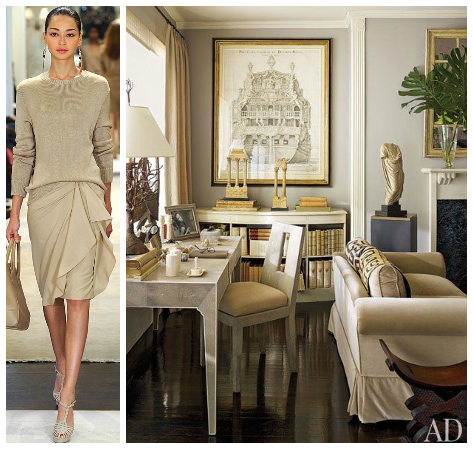
When designing your workspace, taking into consideration the 5 Tips for Home Office Design, Hadley Court contributor Leslie Carothers shared with you yesterday, the 5th one being color, I thought today I’d have some fun and show you how to tie in Pantone’s fall ’14 colors + Spring ’15 colors with the latest fashions seen in Fall ’14 and Spring ’15 fashion shows with home office design, as in the lead example (shown above) of an elegant Pre-Fall look from the icon of elegance, Ralph Lauren, paired with Nina Griscom’s elegant Manhattan apartment - designed by her, both layered in Pantone’s Fall 2014 version of Cognac.


From the stylish shows to your study: Above: Pantone’s color of the year 2014 [ #COY14] , Radiant Orchid , paired with a Barbara Casalola double breasted pantsuit, and a home study with Radiant Orchid lacquered millwork, designed by Lindsay Coral Harper for a showhouse she participated in.
Below are a few other examples of Pantone’s Fall 2014 colors (you can read more about them here) paired with looks from from the runways + inspiring workspaces to give you ideas of how you can create a luxurious home office workspace to call your own…

Above: Runway Look: Ralph Lauren velvet three piece suit - Pantone Aurora Red
Home Office furnished with: AERIN { Lauder }. Her collection can be seen at #HPMkt.
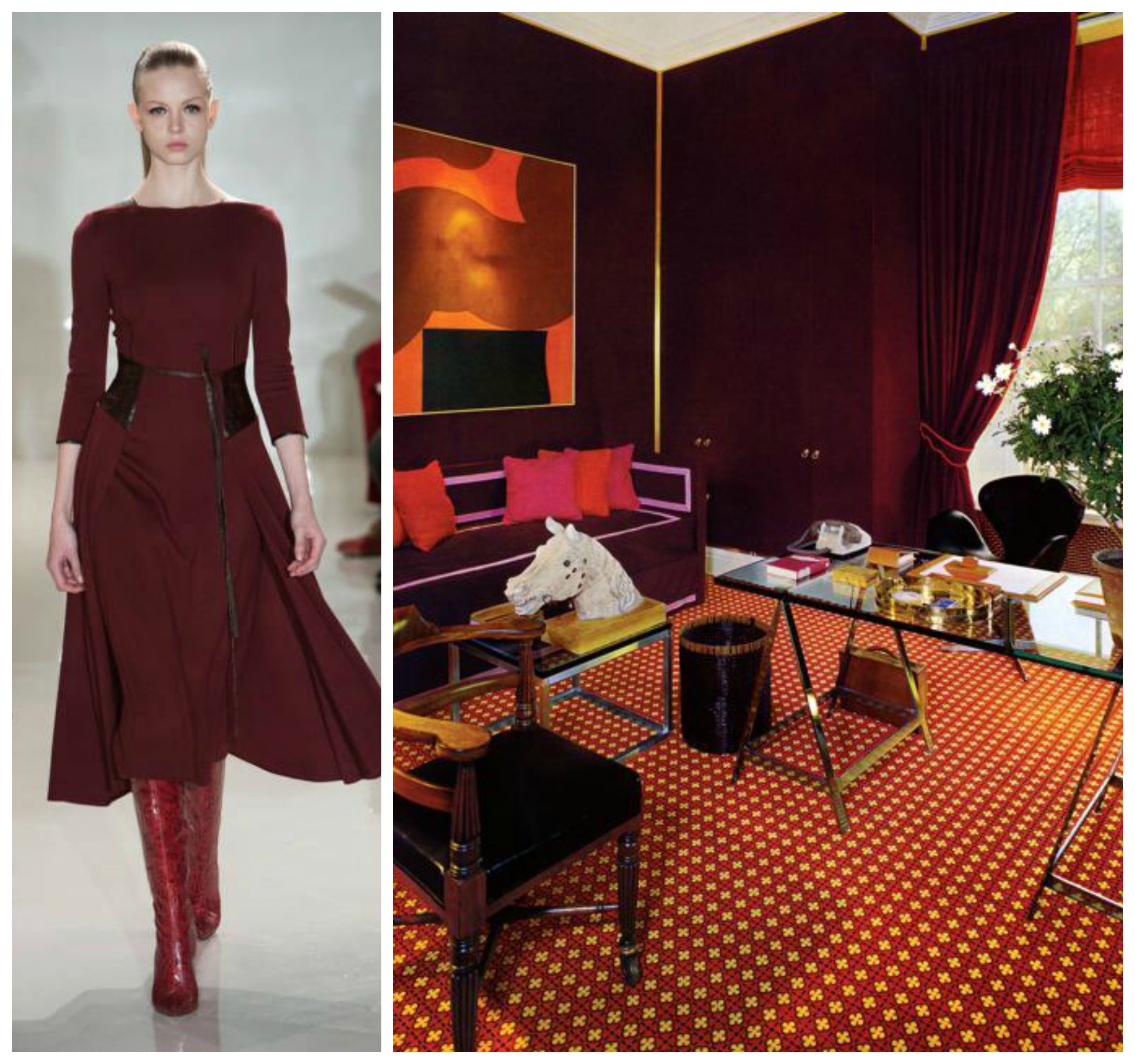
Above: Runway look: Ralph Rucci Fall | Winter 2014 - Pantone Sangria
Home office designed by David Hicks

Above: Runway Look: Christopher Kane velvet double breasted suit - Pantone Royal Blue
Workspace: Royal blue lacquer office designed by Jennifer and Jane Connell of Fun House Furnishings and Design in New Jersey.

Color selections for a season can actually become timeless. An example of a timeless color is Pantone’s Fall 2014 color choice of Cypress - as displayed above in a home office in Dallas, designed in 2008 by Julio Quinones, again with lacquered wall finishes, to the runway look, which is from the Spring 2015 collection of Peter Som . A variation of Cypress can also be seen in Pantone’s Spring 2015 Colors for Men.


PANTONE - SPRING 2015 COLORS
Recently, during New York’s Fashion Week, Pantone released its Fashion Color Report for Spring 2015, with a comprehensive overview of designers’ use of color in their upcoming collections. Leatrice Eiseman, executive director of the Pantone Color Institute commented, “Many feel compelled to be connected around the clock because we are afraid we’ll miss something important. There is a growing movement to step out and create ‘quiet zones’ to disconnect from technology and unwind, giving ourselves time to stop and be still,” - which can be seen in the almost watercolor-like, softer shades of the Spring 2015 Womens Palette, as shown below…

How light, airy, and optimistic is this hue you can use from Pantone called Custard? It looked absolutely dreamy, floating down the runway of yet another of Ralph Lauren’s storybook style shows for Spring 2015 during New York’s Fashion Week. And just as dreamy is this ultra feminine office, with a barely-there Lucite desk, designed by Amanda Nisbet.

The look of minimalism made a strong statement on the NYFW runway for Spring 2015, as seen in this dress by Yigal Azrouel, above. Minimalism to some may bring to mind a cold empty loft space void of warmth - but that need not be the case. Minimalism can also be interpreted as clutter free. When applied to a traditional interior, it becomes a more refined and sophisticated space, as shown above in the home office designed by Dallas based Tracy Hardenburg Designs, where she floated a Barbara Barry vanity as a desk in the center of a (Pantone) toasted almond rug.

Another of nature’s colors interpreted by Pantone for its Spring 2015 palette is called Glacier Gray, which Carolina Herrera applied a bit to her Spring 2015 collection, and you can apply to your workspace - again with minimal, refined sophistication and elegance. What drew me to pair these two images was the focal point square on Carolina’s ensemble vs. the focal point of this office space, designed by Linda McDougald’s team at Postcards from Paris, a grid gallery collage of mirror-framed Trowbridge Gallery prints. I also admired the elegant Barbara Barry desk accessories.

Without a doubt, and even without Pantone, the most timeless color pairing of all - for both fashion and decor, is classic black and white. And that doesn’t mean the space has to be only black and white. The space can actually be shades of grey, with black and white accents. Here, Diane von Furstenberg’s Spring RTW print coat dress can become the inspiration for a printed custom panels and valance window treatment, as in this space designed by Joel Woodard - who ironically is both an interior & fashion designer - located in the same state as Pantone: New Jersey.
I hope you found this fashion & decor post on color and your workspace inspiring and I invite you to see my previous post New York Fashion Week Trends Translated Into Timeless Interiors .
For all designers, editors, retailers and exhibitors heading to the upcoming High Point Fall Market – the “Fashion Week” for the furniture and interior design industries - I hope you will also be inspired to buy home office furniture there and then come home and create beautiful home office workspaces for yourselves.
Lynda Quintero-Davids
for
Leslie Hendrix Wood
Founder
Editor In Chief
Hadley Court
Decorator
Chancellor Interiors
Midland, Texas
~~~
Gracious Living. Timeless Design. Family Traditions.
We invite you to please subscribe to Hadley Court here and to follow Hadley Court on
Pinterest, Facebook, Twitter and Instagram, here, here, here and here.
Stay tuned for our last #TimelessDesign giveaway - going live on the blog tomorrow. Have this week’s posts given you a hint of what the item might be??
Let us know in the comments and…
thank you for reading and subscribing to Hadley Court.
We appreciate you!